Project 04 / 04

Let Us Revive

Brand Identity Designer / 2024


Building an approachable identity for everyday sustainable choices.
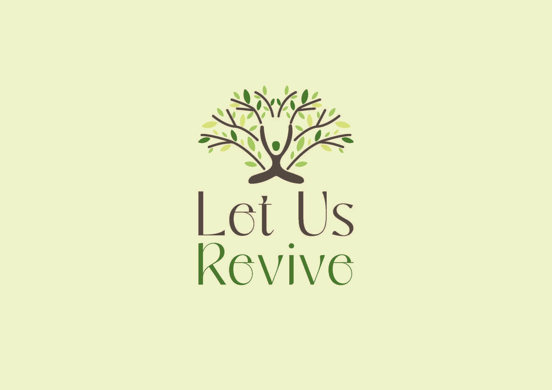
Let Us Revive primary logo and wordmark on a green identity board
Identity systemPrimary green direction

Better Choices, Better Future

Let Us Revive presents sustainable living as an approachable everyday choice. The identity begins with the brand message, Better Choices, Better Future, and gives it a bright, optimistic visual foundation.

The primary green direction establishes the identity's optimistic environmental character.
A secondary pink colorway broadens the system without changing its core message.

A Living Symbol

The mark combines a human figure with branching leaf forms, expressing personal action, growth, and environmental renewal in one compact symbol.

The primary lockup pairs the living symbol with a clear, approachable wordmark.
The same logo geometry remains recognizable in the secondary palette.

Designed for Everyday Life

The identity extends onto reusable tote bags, showing how the mark remains recognizable and expressive beyond the primary logo board.

The green application carries the full brand expression into an everyday reusable object.
The pink application demonstrates the flexibility of the secondary colorway.

Packaging With Personality

Green and pink applications carry the same graphic language across milk packaging and reusable cups while retaining distinct colorway personalities.

The primary identity scales into a clear, confident packaging system.
The secondary palette keeps the packaging family expressive and consistent.
The symbol remains distinctive at a smaller everyday application scale.
Across both palettes, the system keeps one coherent visual voice.

The identity forms one consistent visual language across the brand mark, packaging, and reusable everyday applications.

Metadata

Year
2024
Role
Brand Identity Designer
Focus
Brand Strategy, Logo Design, Visual Identity, Packaging Applications
Last updated
May 01, 2026